
Helpful Techniques For Building Mobile Website With Lots Of Content
Adopting a content-heavy mobile website design is challenging for the majority of businesses. They only wonder, “How can you even view tones of excellent stuff on such a small screen?,” but that’s all that comes to mind.
While many of them abandon the notion altogether, some do rise to the challenge of allowing users to browse, squeeze, enlarge, and squint their way around their websites.
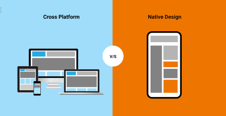
Webpages are important, but it’s also important to consider where consumers are actually seeing the websites. For instance, when seen on a smartphone, a picture gallery undoubtedly falls flat, but this is not the case on desktops, laptops, or tablets.
So how do you evaluate a mobile website’s performance? What fundamental techniques should be used to build a mobile website with a clear user interface and a satisfying user experience? Let’s investigate.
Reveal content progressively
When websites are filled with a lot of information, mobile screens appear significantly smaller. As a result, users frequently experience information overload, which makes it difficult for them to decide what content to view, what to read, and how to proceed.
This occurs as a result of the sudden presentation of too many details. With this tactic in place, users only see a fraction of the complete content. The user can scroll, tap, or swipe to access more content, which is then gradually disclosed as they do so.
Users may now simply access vital content and view supplied call to actions so that they can use them without difficulty.
Ads should not be annoying
A mobile website’s user experience will undoubtedly suffer from ads that are improperly integrated. To understand how adverts will influence you as a user browsing a website, you must put yourself in their shoes.
On the mobile website, there shouldn’t be many adverts so as to preserve the value of the high-quality content. When people are focused on viewing the website’s content, advertisements shouldn’t be disruptive.
Carousels necessary for interactive viewing
Carousels are user interface components that show more content when users swipe them horizontally. When highlighting significant text and image displays, they function optimally.
Sticky navigation for rapid browsing
Sticky navigation is navigation that doesn’t change depending on which page is being viewed. In addition to being helpful for quick browsing, which speeds up by 22%, accessibility is much improved. This is especially helpful for smartphone users who quickly browse webpages.
UX with large touch
Instead of using their desktops, laptops, or tablets, users choose to access content via their mobile devices. On touchscreen mobile devices, fingers are less accurate than a mouse pointer, thus in practice people find it more unpleasant and challenging.
As a result, a mobile site should have enormous features including large graphics, large call to actions, and high font sizes. Smartphone screen sizes should typically be at least 40*40 pixels with a 10-pixel border all around.
Optimize website content for mobile visibility
A straightforward design seems to perform better on mobile devices than an aesthetically pleasing design. A design is even more powerful if it possesses both characteristics.
Therefore, while building a website, simply consider how it would look on mobile. If the users are satisfied with the information and it is efficiently presented to them without any interruptions, your design was successful.
UI should do all the work
Designing elements that are responsive to many platforms, browsers, and screen sizes is a tremendous nuisance. You need not worry about having to style your own elements for user interface components like sliders, radio buttons, dropdowns, and others because you may draw from the native ones that already exist.
These components already have a sizable touch capability, and more importantly, they look fantastic on any device.
Landscape to portrait, and vice versa
Almost all smartphones are set to either landscape or portrait mode by default. Websites must be sufficiently responsive to switch between the two orientations. When holding the phone in either of these positions, a fluid grid pattern shows to be very helpful in transitioning.
Conclusion
Users browse websites to find relevant content that suits their needs and may even interact with site elements. Hosting just fulfils half of the role; the other half is filled by a suitable design.
Users want material to be easily consumable and accessible across a variety of platforms, browsers, and screen sizes when they visit a website to watch, listen, browse, read, or study.
When optimizing the content in the design, keep the users in mind. You will win their support, resources, and time in this manner.


