

The Psychology Behind Aesthetic UI Design
Table of Contents
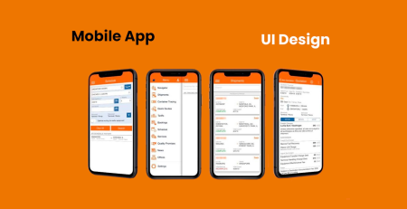
User interface (UI) design in today’s digital environment is considerably more than just aesthetics. It takes more than simply making things seem good; it also involves comprehending the psychology of user interactions and creating experiences that connect with people deeply. This article delves into the intriguing field of UI design psychology, examining the ways in which specific design features might impact user behavior and perception. We’ll share the techniques for crafting visually appealing user interfaces (UIs) that enthrall and involve people with perceptive examples and useful code snippets.
Understanding User Perception in UI Design
In order to design user interfaces (UIs) that effectively communicate with users on a profound level, it is essential to comprehend human perception. The term “user perception” describes how people understand and make meaning of the visual components that are displayed to them in a digital interface. It includes elements like typography, color psychology, visual hierarchy, and general design aesthetics, all of which influence how the user interacts and experiences the user interface.
Visual Hierarchy
A fundamental tenet of user interface design, visual hierarchy describes how items are arranged and prioritized within an interface to direct users’ attention and highlight the significance of certain material over others. Through the intentional arrangement of items according to their visual characteristics, like as color, contrast, size, and closeness, designers may produce interfaces that are more intuitive to use and comprehend. Here’s a closer look at visual hierarchy’s operation and significance in user interface design:
- Size and Scale:
Larger elements tend to attract more attention than smaller ones. By varying the size of elements such as headings, buttons, and images, designers can signal their relative importance within the interface. For example, a headline set in a larger font size suggests its significance compared to surrounding text. - Color and Contrast:
Aspects like color and contrast can also affect how items are arranged visually. Vibrant hues and stark contrast combinations grab the eye and may be employed to bring attention to crucial components, including alerts or call-to-action buttons. On the other hand, to reduce visual clutter, less significant aspects might be represented by subdued colors or low contrast combinations. - Typography:
One important factor in creating hierarchy in text-based material is typography. Designers are able to distinguish between headings, subheadings, body text, and other textual parts by utilizing distinct font weights, styles, and sizes. For instance, headers may be made to stand out from the surrounding content by choosing an italic or bold typeface. - Whitespace:
The empty space in a design that exists between pieces is called whitespace, or negative space. It keeps things from seeming claustrophobic or cluttered, which aids in the creation of separation, balance, and visual clarity. Designers may enhance readability and draw attention to key components by carefully utilizing whitespace. - Visual Grouping:
Elements that are visually related or functionally connected should be grouped together to reinforce their relationship and create visual coherence. This can be achieved through techniques such as proximity (placing related elements close to each other), alignment (lining up elements along a common axis), and enclosure (placing elements within a container). - Hierarchy in Navigation:
In navigation menus and interfaces with multiple layers of content, designers should establish a clear hierarchy to help users understand the structure and hierarchy of information. This can be achieved through techniques such as indentation, dropdown menus, breadcrumbs, and visual cues such as arrows or icons.
Importance of Visual Hierarchy in UI Design:
- Guides User Attention: Visual hierarchy helps users quickly identify important elements and navigate the interface more efficiently.
- Improves Readability: By organizing content in a hierarchical manner, designers can enhance readability and comprehension, making it easier for users to consume information.
- Enhances Usability: A well-structured visual hierarchy improves the overall usability of the interface by reducing cognitive load and helping users find what they need more easily.
- Reinforces Brand Identity: Visual hierarchy allows designers to emphasize brand elements such as logos, colors, and typography, reinforcing brand identity and recognition.
- Encourages Interaction: By drawing attention to interactive elements such as buttons and links, visual hierarchy encourages user interaction and engagement with the interface.
In summary, visual hierarchy is a fundamental principle in UI design that helps designers create interfaces that are intuitive, engaging, and easy to navigate. By strategically organizing elements based on size, color, typography, whitespace, and grouping, designers can guide users’ attention, improve readability, and enhance the overall user experience.
Color Psychology
The study of color’s effects on human emotions, behavior, and perceptions is known as color psychology. To successfully interact with people and create interfaces that elicit the necessary emotional reactions, UI designers must have a solid grasp of color psychology. Here’s a closer look at color psychology’s tenets and how UI design may use them:
- Warm Colors vs. Cool Colors:
Warm colors (like red, orange, and yellow) and cool colors (like blue, green, and purple) are the two basic categories into which colors can be divided. While cold colors are linked to stability, peace, and tranquility, warm colors often arouse sensations of vitality, warmth, and enthusiasm. These connections may be used by UI designers to elicit particular feelings and provide the right atmosphere for the user interface. - Color Associations:
There are many cultural implications and meanings connected to different hues. Red, for instance, is frequently connected to passion, urgency, and significance, whereas blue is frequently connected to professionalism, trustworthiness, and dependability. Designers may select colors that complement the interface’s communication objectives and brand identity by being aware of these relationships. - Color Harmony and Contrast:
While contrast refers to the variation in brightness or hue between parts, color harmony is the aesthetically attractive arrangement of colors within a design. Color harmony is a tool used by designers to build visually pleasing interfaces; contrast, on the other hand, helps draw attention to key parts and enhance readability. For instance, a lively and well-balanced color scheme may be created by utilizing complimentary colors, which are opposite each other on the color wheel. Additionally, readability can be improved by choosing high contrast colors for the background and text. - Cultural Considerations:
distinct civilizations might associate colors with distinct meanings. For instance, although white is connected to simplicity and purity in Western civilizations, in many Eastern traditions it represents death and sadness. Designers must take into account cultural variances and select colors that appeal to the target audience when creating interfaces for a global audience. - Color Accessibility:
When creating interfaces, designers must take into account color accessibility in addition to emotional and cultural factors. A fourth of people on the planet suffer from color vision impairments, such as red-green color blindness. To successfully communicate information to all users, designers should make sure that color selections do not only rely on color perception and include substitute signals, such as text labels or patterns. - Brand Identity and Consistency:
In order to define a company’s identity and build brand awareness, colors are essential. When selecting colors for a brand, designers should keep in mind its values, personality, and objectives. They should also make sure that the colors are used consistently throughout various interfaces and touchpoints. Using color consistently promotes a unified user experience and strengthens brand identification.
In summary, color psychology is a powerful tool for UI designers to create interfaces that engage users emotionally, communicate effectively, and reflect the brand identity. By understanding the psychological associations of different colors, considering cultural differences, ensuring color accessibility, and maintaining consistency in color usage, designers can create visually compelling and impactful interfaces that resonate with users on a deeper level.
Typography
In user interface (UI) design, typography is essential because it affects readability, attractiveness, and user experience. The interface’s desired tone and personality are conveyed through the careful selection, arrangement, and display of typefaces, font sizes, spacing, and alignment. These elements work together to successfully transmit information. The significance of typography in UI design is examined in more detail below, along with some important factors to keep in mind while selecting fonts:
- Readability and Legibility:
In user interface design, typography serves the main purpose of making text material easily understandable and intelligible for users. It is important for designers to select fonts and font sizes that are readable and legible across a range of screen sizes and resolutions. To maximize legibility, factors that affect reading such as letter spacing (kerning), line spacing (leading), and line length (measure) should be properly taken into account. - Hierarchy and Emphasis:
Typography helps establish a hierarchy of information within the interface, guiding users’ attention and emphasizing important content. By using variations in font size, weight (boldness), and style (italicization), designers can differentiate between headings, subheadings, body text, and other textual elements, making it easier for users to scan and navigate the content. - Brand Identity and Personality:
A brand or product’s entire visual identity and personality are greatly influenced by its typography. Different fonts elicit different feelings and portray different personalities. For instance, a sans-serif typeface may imply modernism and simplicity, but a serif typeface may signify tradition and professionalism. In order to strengthen brand identification and produce a unified user experience, designers should use fonts that complement the company’s values, tone, and intended audience. - Consistency and Cohesion:
Maintaining a consistent font style improves readability and visual coherence across various displays and interfaces. For visual harmony and brand identification, designers should create a uniform typographic system that includes font selections, sizes, styles, and spacing. Typographic consistency encourages a feeling of familiarity and trust among users and facilitates more natural interface navigation. - Accessibility:
In order to provide accessibility for individuals with visual impairments or reading difficulties, typography is also important. In order to improve readability, designers should use fonts and font sizes that are readable by those with limited vision and that offer enough color contrast between the text and backdrop. Furthermore, making various text formats and font sizes available enhances accessibility for all users. - Responsive Design:
With the proliferation of devices with various screen sizes and orientations, responsive typography is essential for ensuring a consistent reading experience across different devices. Designers use techniques such as fluid typography (scaling font sizes proportionally with screen size), breakpoints, and media queries to optimize typography for different viewport sizes and maintain readability and legibility.
In summary, typography is a critical element of UI design that influences readability, hierarchy, brand identity, consistency, accessibility, and responsive design. By carefully selecting and implementing typographic choices, designers can create interfaces that effectively communicate information, engage users, and enhance the overall user experience.


Leave a Reply