
The Ultimate Guide to Vertical and Horizontal Div Centering
Table of Contents
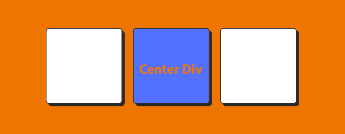
Web design div centering is an essential skill that all developers need to learn. Reaching precise alignment is frequently difficult, regardless of whether you’re aligning material horizontally, vertically, or both. We’ll go deep into the methods and best practices for using CSS to center divs both vertically and horizontally in this extensive article. You’ll have a solid grasp of the several techniques and code samples needed to accomplish pixel-perfect div centering in your web projects by the conclusion of this post.
Section 1: Understanding the Box Model
A key idea in web design that explains the arrangement and presentation of items on a webpage is the CSS box model. In essence, every HTML element is a rectangular box, and the box model specifies the dimensions, padding, border, and margin of this box. It is essential to comprehend the box model in order to style and arrange items on a webpage in an efficient manner.
1.1. Content Area:
The content area of an element is where the actual content, such as text, images, or other media, is displayed. It is defined by the width and height properties.
1.2. Padding:
Padding is the space between the content area and the element’s border. It provides visual separation between the content and the border. Padding can be adjusted using the padding-top, padding-right, padding-bottom, and padding-left properties.
1.3. Border:
The border surrounds the padding and content area, providing a visual boundary for the element. Borders can be styled with different colors, widths, and styles using the border property.
1.4. Margin:
The area outside an element’s border that separates it from neighboring elements is called the margin. Margins are translucent by default and lack a backdrop color and border. Margin may also be changed with the margin-top, margin-right, margin-bottom, and margin-left attributes, exactly like padding.
1.5. Box Model Calculation:
When specifying the width and height of an element, it’s essential to consider the entire box model. The total width and height of an element are calculated by adding together the content width/height, padding, border, and margin.
1.6. Box Sizing Property:
Developers can define how the width and height of an element should be computed by using the box-sizing attribute. Content-box is the default value, which solely counts the content area when determining width and height. When box-sizing is set to border-box, padding and border are included in the computation, which facilitates working with layouts with fixed widths.
/* Example of using box-sizing property */
.box {
  box-sizing: border-box;
  width: 300px; /* Includes padding and border */
  padding: 20px;
  border: 1px solid #000;
  margin: 10px;
}
1.7. Browser Compatibility:
It’s important to note that different browsers may have slight variations in how they interpret the box model, especially in older versions of Internet Explorer. Using a CSS reset or normalization stylesheet can help ensure consistent rendering across different browsers.
A thorough understanding of the CSS box model is necessary for efficient web layout and design. Developers may design visually appealing and well-structured webpages with precise control over element spacing and positioning by grasping the ideas covered in this part.
Section 2: Horizontal Centering Div Techniques
Horizontal centering is a common requirement in web design, especially when it comes to aligning elements such as navigation menus, images, or text blocks. In this section, we’ll explore several techniques for horizontally centering elements using CSS.
2.1. Margin Auto:
One of the simplest and most widely used methods for horizontally centering a block-level element is by setting its left and right margins to auto. This technique takes advantage of automatic margin calculation to evenly distribute the available space on both sides of the element.
.centered-element {
  margin-left: auto;
  margin-right: auto;
}
By setting both the left and right margins to auto, the browser will automatically calculate and distribute the remaining space equally on either side of the element, effectively centering it horizontally within its parent container.
2.2. Flexbox:
Flexbox is a powerful layout model introduced in CSS3 that provides a more efficient way to align and distribute space among items in a container, even when their size is unknown or dynamic. To horizontally center an element using Flexbox, you can set the parent container’s display property to flex and use the justify-content property with the value center.
.parent-container {
  display: flex;
  justify-content: center;
}
By setting justify-content to center, Flexbox will distribute the extra space evenly before and after the child elements within the container, effectively centering them horizontally.
2.3. Absolute Positioning with Transform:
Another method for horizontally centering elements involves using absolute positioning combined with the transform property. This technique is particularly useful when you need to center an element within its containing block, regardless of the parent’s size or position.
.centered-element {
  position: absolute;
  left: 50%;
  transform: translateX(-50%);
}
By setting the left position to 50% and using the transform property to translate the element horizontally by -50% of its own width, the element will be horizontally centered within its containing block.
2.4. CSS Grid:
CSS Grid Layout is another powerful layout model that allows you to create two-dimensional grid-based layouts with ease. To horizontally center an element using CSS Grid, you can use the justify-self property with the value center on the child element within the grid container.
.parent-container {
  display: grid;
}

.centered-element {
  justify-self: center;
}
By setting justify-self to center on the child element, CSS Grid will center the element horizontally within its grid cell, effectively centering it within the grid container.
This section has covered a number of CSS methods, such as margin auto, Flexbox, absolute positioning with transform, and CSS Grid, for centering components horizontally. Choose the approach that best fits your unique layout needs by experimenting with them; each has advantages and use cases of its own. You may center things horizontally in your web projects with confidence when you have these approaches in your toolbox, which will guarantee a refined and polished look.
Section 3: Vertical Centering Div Techniques
Vertical centering can be a bit more challenging than horizontal centering in web design, especially when dealing with elements of varying heights. In this section, we’ll explore several techniques for vertically centering elements using CSS.
3.1. Flexbox:
Flexbox provides a straightforward way to vertically center elements within a container. By setting the parent container’s display property to flex and using the align-items property with the value center, you can easily vertically center the child elements.
.parent-container {
  display: flex;
  align-items: center;
}
With align-items set to center, Flexbox will vertically align the child elements within the container, regardless of their heights.
3.2. Absolute Positioning with Transform:
Similar to horizontal centering, absolute positioning combined with the transform property can be used for vertical centering as well. This technique is particularly useful when you need to center an element vertically within its containing block.
.centered-element {
  position: absolute;
  top: 50%;
  transform: translateY(-50%);
}
By setting the top position to 50% and using the transform property to translate the element vertically by -50% of its own height, the element will be vertically centered within its containing block.
3.3. CSS Grid:
CSS Grid Layout also offers a solution for vertical centering using the align-self property. By setting align-self to center on the child element within the grid container, you can vertically center the element within its grid cell.
.parent-container {
  display: grid;
}

.centered-element {
  align-self: center;
}
With align-self set to center, CSS Grid will vertically center the child element within its grid cell, ensuring vertical alignment within the grid container.
3.4. Flexbox with Absolute Positioning:
Combining Flexbox with absolute positioning can provide additional flexibility for vertically centering elements, especially when dealing with complex layouts. By setting the parent container to display: flex and using the align-items property with the value center, you can vertically center the child elements.
.parent-container {
  display: flex;
  align-items: center;
}

.centered-element {
  position: relative;
  top: 50%;
  transform: translateY(-50%);
}
This section has covered a number of CSS methods for centering components vertically, such as Flexbox, absolute positioning with transform, and CSS Grid. Try trying a few different techniques to see which one best fits your needs; each has advantages and applications of its own. With these tools at your disposal, you can center items vertically in your web projects with confidence, producing designs that are both aesthetically beautiful and visually balanced.


Leave a Reply