

UI/UX Design Trends
The latest trends in UX/UI design highlight what we’ve all been seeing over the years: mobile-first, wearables, and simplicity as a prerequisite for sophistication. Building digital products has never been enough, but this time designers are looking to architect user experiences that revolve around the users rather than the product. Personalization is the name of the game, and the UX/UI trends for 2023 prove it.
Let’s pause for a moment before diving into the current UI/UX trends. To fully grasp what is going on, we must first define the term “personalization.” It is the state in which the user can modify nearly every tiny aspect of the application’s design to suit their specific needs while performing the same set of actions.
Apple Watch and other similar products with closing fitness rings are excellent examples of this approach. Clock faces and details such as battery indicator, date, workouts, and time zones reveal what people care about. They have complete control over what is truly beneficial to them. Companies want options in application UX/UI, but how products are used is determined by customers.
Today, the only way for anyone to be successful with their product is to find a way to personalize it while remaining true to its original concept and ensuring that it is usable across the board. What exactly do we mean by that? The first trend is the solution.
Top UX/UI trends for 2023
Device synchronization
This trend is especially significant because it indirectly defines all other trends. People want to use applications because they are available, not because they are good. There are numerous products to select from. Cheaper, more expensive, bare-bones, or fully loaded with functionalities. The option is not a problem. The issue is whether a user can sync settings and content between a personal computer, laptop, phone, tablet, smartwatch, or any other web-connected digital device.
Ordinary people require it as well as businessmen. The ability to browse the web and customize the experience, with the option of having everything on any device flawlessly, is what defines “usability” in 2023 and beyond.
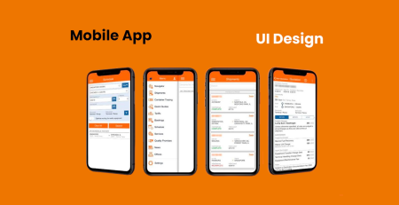
Mobile-first design
A logical extension of the preceding point. People use their mobile devices in a variety of ways and for a variety of reasons. Booking flights, talking with friends, participating in online calls, online window shopping, actual shopping, and a variety of other activities. Everything is done on the fly for your convenience.
That is why UX and UI design should be created for almost everything. Applications should use a design language that is easy to understand for users while also being scalable. It will convert visitors into paying customers if it is implemented on every single device.
Design for wearables
First and foremost, it is a thing. Second, because many people use their bands, watches, and other gadgets in multiple ways, it is becoming increasingly important. For personal, professional, and social use, forcing designers to innovate on an entirely new level.
The goal is to keep interruptions to a minimum. Users want to know what’s going on, but designing a feed that is both helpful and not intrusive is difficult. Graphic artists will focus on delivering content in a more natural and friendly manner in 2023. Another prominent trend is “mirror design,” which requires teams to architect applications in a similar manner for multiple devices. If something happens on a smartphone, it should be mirrored (or even possible) on a tablet or a smartwatch. And the other way around.
Prioritizing contextual design is also critical. If you want to record a run, a smartwatch should allow you to listen to music or a podcast while you run. Just a couple of taps away. The final trend is a greater emphasis on light-weight interactions. The ability to respond quickly to a message or text without a full-sized keyboard (via voice recognition or a simple emoji) will go even further. Quick in-app and cross-app interactions, combined with the previously mentioned mirror design, will take a number of applications to the next level. Especially in light of another important UX/UI trend to keep an eye on.
Cross-application design
This is especially evident in FinTech, where many companies seek partners to strengthen and expand their market offering. A company that collaborates with another application should have a dedicated subpage for it as well as mobile-friendly options.
If a customer wants to pay their electric bill through an app and is thinking about getting a mortgage through a third-party partner, the payment app should provide a clear set of rules and options. There is no need for additional software or complicated messaging. And, if there is such a thing, a clear and understandable offer for the user. And simple to compare; users enjoy comparing offers.
ID authentication
There are numerous methods for confirming identity. Fingerprint scanning, retina scanning, and traditional passwords are all options. Among other things. Each one presents a distinct set of challenges. When someone is looking over the user’s shoulder, what and how should a login dialogue be displayed? What should one say when Face ID fails to recognize a face hidden behind a mask? What about a passport photocopy? Do we show a symbolic cover or the user’s actual ID and photo?
The majority of these issues have been addressed in recent years, but some questions remain. What about personal privacy? How can we distinguish ourselves from other apps on the market and demonstrate that our system is truly secure? How does all of this information contribute to and fit into the overall visual identity and branding of the application? How do you say something old in a fresh and creative way? This is most likely one of the most difficult to figure out, latest UX/UI trends to follow.
The scroll is dead, enter scrollytelling
Things have just gotten serious. Previous trends should not be dismissed lightly. It’s just that communicating information to others necessitates an interesting message and a format that the audience will like and accept in the long run. As the new inside joke goes, scrolling is boring. Nobody wants to scroll down for relevant information, hoping that the page’s boring sections will eventually turn into something useful.
Scrollytelling is a method for accomplishing this. It is essentially a set of tricks that energies users and cause them to see a page in a different light. For example, as you scroll, you’ll notice a slew of animations appear alongside the text in the center. Or another graphic that explains what you just read. Scrollytelling is about providing more context, more explainers, and enriching content with dynamic elements that entice users with movement, color, and contextualization.
Making data sexy for users
Users adore their applications. Apps collect information. Users are occasionally shown data. Users adore their apps, but they are frequently lost in the context of large data pools. Poorly displayed – to conceal or minimize something. Or because the person in charge of UX/UI is unfamiliar with the subject.
The pattern is unmistakable. One of the top priorities in 2023 will be to display data and simplify the messaging that comes from it. Exactly – let me say it again because it’s important. Users do not simply want to see data in an understandable format. They want to fully comprehend it. That means removing everything that is distracting from the screen.
It also implies, for example, excessively large numbers and areas into which users can tap. With a physical tap, yes. Why? Because interaction is also crucial. Because not everything can or should be displayed on a single screen, people must have the option to view additional information. This can be obtained, for example, through a tap and deep dive into a category or spending. However, in order to tap it and learn more, users must have some breathing room. It is not a good idea to cram everything together in order to display more information.
The emotional design will get even more traction
It makes no difference whether you’re using a smartwatch, tablet, smartphone, or potato. You put your content somewhere. You’re most likely using it to view your monthly spending, track your physical activity progress, and so on. The app provides feedback. No, feedback, not information. It provides context when combined with an icon (band, watch, phone) or a more complicated image (even a splash-screen, at times).
You were able to save money this month. You just set a new record for a one-mile run. You have made more business contacts than the previous quarter. You deserve congratulations! And designers, you’ve mastered the art of receiving well-deserved praise. Designing these messages, which are typically a combination of microcopy and graphics, brings users closer to their objectives. It also builds customer loyalty. In the coming months, the importance of emotional design will only grow.


Leave a Reply